

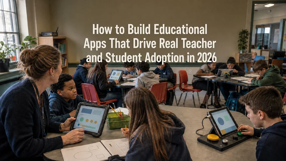
Every school district has at least one app that was purchased with enthusiasm, rolled out with a training session, and abandoned by October. The license renews anyway, because switching costs more political capital than nobody using it quietly does. This pattern is so common in education technology that “shelfware” has become its own budget line item.
The uncomfortable truth is that most of these tools weren’t badly built. They passed procurement. They demoed well. They had the features on the RFP checklist. What they didn’t have was a development process that treated the people using them every day as more than end users to be onboarded after the fact.
Adoption in EdTech isn’t a marketing problem or a training problem. It’s a series of technical and design decisions made months before launch decisions about connectivity, accessibility, information hierarchy, and incentive design. Get these wrong and no amount of professional development will save the rollout. Get them right, and the app becomes invisible infrastructure that teachers stop noticing because it simply works.
Why Most EdTech Apps Fail at Adoption, Not at Launch
Launch day metrics are almost always good. Everyone logs in once. The failure happens in week three, when the novelty wears off, and the tool has to compete with a teacher’s existing workflow the one built from paper, muscle memory, and whatever worked last year.
The apps that survive that competition share a pattern: they were built around how a classroom actually operates, not around an idealized version of one. That means accounting for shared devices, unreliable Wi-Fi, thirty-second passing periods, and a teacher who has four minutes before the bell to check whether anyone finished last night’s assignment. An app designed in a well-lit product meeting, tested on fast office internet, rarely survives contact with a real school building.
The fix isn’t a better feature set. It’s building with constraints from the actual environment baked in from the first sprint, not patched in after complaints arrive.
Build for Unreliable Connectivity With an Offline-First Architecture
School Wi-Fi is not office Wi-Fi. Bandwidth gets divided across hundreds of devices, older buildings have dead zones in specific classrooms, and IT departments often throttle or block traffic unpredictably. An app that assumes a stable connection will fail exactly when a teacher needs it most mid-lesson, in front of thirty students.
Offline-first architecture means the app’s core functions viewing assignments, entering grades, submitting work, tracking progress work fully without a live connection, syncing automatically once one is available. This is a foundational architecture decision, not a feature that gets added later. Retrofitting offline support onto an app built assuming constant connectivity usually means rebuilding the data layer from scratch.
The practical test: can a teacher take attendance, assign work, and record a grade during a network outage, with everything reconciling cleanly when the connection returns? If the honest answer is no, the app will get used exactly until the first outage, and then it won’t.
Build Accessibility Into Educational Apps From Day One
Accessibility in education isn’t a compliance checkbox; it’s a legal requirement and a practical necessity, because classrooms include students with a wide range of visual, auditory, motor, and cognitive needs, often without formal documentation reaching every teacher who needs it.
Building to WCAG 2.2 AA standards from the first wireframe is dramatically cheaper than retrofitting it after launch. Screen reader compatibility, keyboard navigation, sufficient color contrast, resizable text without layout breakage, and captioning for any audio or video content all need to be architectural decisions, not QA tickets filed after a complaint.
There’s also a second-order effect worth noting: interfaces designed for accessibility tend to be clearer for everyone. Larger touch targets, unambiguous labeling, and reduced reliance on color alone to convey meaning make the app easier to use in a noisy classroom on a scratched tablet screen, not just for students with documented needs.
Design Teacher Dashboards Around Daily Classroom Decisions
Teacher dashboards are where most EdTech products reveal whether they were designed for the classroom or for the sales deck. A dashboard that surfaces every metric the platform can technically capture is not more useful; it’s a wall of noise that a teacher has to parse during a planning period that barely exists.
What teachers consistently need, in order of urgency:
- Who needs help right now, flagged students, incomplete work, or performance dropping below a threshold- visible without digging
- What needs grading or reviewing today, sorted by deadline, not alphabetically by student name
- A fast path to communicate with a student or parent from the same screen where the issue was spotted
- Trends over time that are skimmable in seconds, not dashboards requiring a filtering session to interpret
Every additional data point competes for attention with these four things. The design question isn’t “what can we show,” it’s “what can we justify making a teacher look at instead of their next lesson plan.” Progressive disclosure surfacing detail only when someone drills in tends to outperform comprehensive default views in actual usage data, even when comprehensive views test better in demos.
Student Engagement That Supports Learning, Not Just Gamification
Points, badges, and leaderboards are the easiest engagement mechanics to build and the least durable. They produce a burst of activity when novel and a measurable drop-off once students calibrate to how little the rewards actually mean. Leaderboards in particular can actively discourage struggling students, who learn quickly that they’ll never appear near the top and disengage rather than compete.
Mechanics that hold up over a full school year tend to share different properties:
- Visible progress toward a concrete goal a skill tree or mastery map students can see themselves moving through, rather than an abstract point total
- Low-stakes retry loops: the ability to attempt a problem again without penalty, which keeps students in a productive struggle rather than avoiding attempts they might fail.
- Peer visibility without ranking: seeing that classmates are also working, without a scoreboard that turns it into a public comparison.
- Immediate, specific feedback telling a student what to fix, not just whether they got a red X
The pattern across all of these is that they reinforce the actual learning goal instead of sitting on top of it as an unrelated reward layer. Gamification that works is barely distinguishable from good instructional design; gamification that fails is a layer of shiny mechanics bolted onto content that hasn’t changed.
Involve Teachers Before Development Decisions Are Locked In
The single highest-leverage decision in EdTech development is when teachers enter the process. Most projects bring them in for training, once the product is built and the roadmap is locked. By then, every fix is a workaround rather than a redesign.
Involving teachers earlier looks like:
- Shadowing before wireframing: Spending time in actual classrooms, watching the workflow the app will replace or augment, before a single screen is designed.
- Working prototypes in real classrooms, not focus groups: A prototype tested in a conference room with adults giving polite feedback behaves nothing like one tested with thirty students and a ringing bell.
- A standing feedback channel that closes the loop visibly: Teachers who report a problem and see it addressed keep reporting problems. Teachers who report a problem into a void stop bothering, and stop trusting the tool.
- Piloting with a range of teachers, not just the enthusiastic ones: The teacher who’s skeptical of new technology will surface friction that the early adopters won’t notice, because they’ve already adapted around it.
This isn’t a nicety that improves morale. It’s the mechanism by which the technical decisions above offline behavior, accessibility, dashboard hierarchy, engagement design get validated against reality instead of assumption. Every EdTech tool that reaches its second and third year of genuine use was shaped by people who had to use it, arguing with the people who built it, well before launch day.
The tools that get abandoned after one term were usually built correctly by every internal metric the team was tracking. They just weren’t built with the classroom in the room.
Conclusion
None of the decisions covered here are exotic. Offline-first architecture, WCAG compliance, restrained dashboards, engagement mechanics tied to real progress, and early teacher involvement are all well-understood practices; none of them require a technical breakthrough. What separates the EdTech tools still in use three years after launch from the ones quietly dropped after one term is not access to better technology. It’s whether these decisions were treated as foundational, made before a line of code was written, instead of as fixes bolted on after adoption numbers started slipping.
For administrators evaluating a custom build or an existing vendor, the questions worth asking are simple: What happens when the Wi-Fi drops mid-lesson? Can a screen reader user complete the same tasks as everyone else? What does a teacher actually see first when they log in, and did any teacher help decide that? The answers reveal more about whether a tool will still be running in September of next year than any feature list ever will.
